Exporting Python Plots for LaTeX
For my thesis, I worked with a lot of data in Python Jupyter Notebooks using Numpy and h5py datasets. During the research, I really liked to use the HoloViews library with the Bokeh backend to visualize some of this data because it results in an interactive plot view where you can move and zoom on the plot. However, I didn’t like to use these plots in my LaTeX text because then the text elements of the plot had a different font and size from the main text. Additionally, the size of the text elements in the plots depends on the size of the plot in the text. Therefore, I generated pgf files from the plots using Matplotlib Pyplot. Importing these pgf plots gave the plots in my text a really consistent layout.
Sample Data
In this post, I use two sample datasets to show both plotting mechanisms. One is a simple sine function, the other is a noisy signal sampled from a normal distribution:
1
2
3
4
5
import numpy as np

x = np.linspace(0, 100, 1000)
y_sin = np.sin(x/5)
y_noise = np.random.normal(0, 0.2, x.shape)
In a realistic scenario, this data can be imported from a dataset or is the result of earlier computations.
Plotting Using HoloViews
The HoloViews library allows to generate interactive plots in a Jupyter Notebook really easily by using the Bokeh backend:
1
2
import holoviews as hv
hv.extension('bokeh')
Plotting both datasets is as easy as:
1
2
3
4
5
6
7
8
9
10
11
12
13
14
15
16
17
18
19
20
21
22
23
24
curve1 = hv.Curve((x, y_sin), label='Sine Wave').opts(
    line_width=2,
    tools=['hover'],
    color='blue',
)

curve2 = hv.Curve((x, y_noise), label='Noise').opts(
    line_width=2,
    tools=['hover'],
    color='red',
)

plot = curve1 * curve2
plot.opts(
    title='Example Plot with Holoviews',
    xlabel='X-axis',
    ylabel='Y-axis',
    legend_position='top_right',
    show_grid=True,
    height=400,
    width=600,
)

plot
Where we can provide many parameters to tune the plot to our liking, such as the size, labels, color, and legend. The resulting plot then looks as follows:
The nice thing about this plot is that you can zoom, move, and hover over it using the toolbar at the right side.
Plotting Using Matplotlib Pyplot
We can recreate the plot using the Matplotlib Pyplot library and export it as a pgf file to include the plot in a LaTeX text. This methodology gives all the plots a nice consistent layout with the main text. For the generated pgf file to follow the LaTeX layout and use the correct fonts, we have to setup some parameters:
1
2
3
4
5
6
7
import matplotlib.pyplot as plt

plt.rcParams.update({
    "font.family": "serif",  # use serif/main font for text elements
    "text.usetex": True,     # use inline math for ticks
    "pgf.rcfonts": False     # don't setup fonts from rc parameters
})
We can then generate the plot as follows:
1
2
3
4
5
6
7
8
9
10
11
12
13
14
15
16
17
18
19
20
21
width = 398 # width in pt
height = 296 # height in pt
width_inch = width / 72.27 # convert pt to inch
height_inch = height / 72.27 # convert pt to inch

# Create the plot
plt.figure(figsize=(width_inch, height_inch), dpi=300)
plt.plot(x, y_sin, label=r'$y=\sin(\frac{x}{5})$', color='blue', linewidth=2)
plt.plot(x, y_noise, label='Noise', color='red', linewidth=2)
plt.title('Example Plot with Matplotlib')
plt.xlabel('X-axis')
plt.ylabel('Y-axis')
plt.legend(loc='upper right')
plt.grid(True)
plt.xlim(0, 100)
plt.tight_layout()

# Save plot
plt.savefig('example_plot_mpl.pgf', format='pgf', bbox_inches='tight')

plt.show()
An additional benefit of this method is that we can use inline math mode from LaTeX in text elements such as the legend label for the sine function ($y=\sin(\frac{x}{5})$). This results in the following plot: 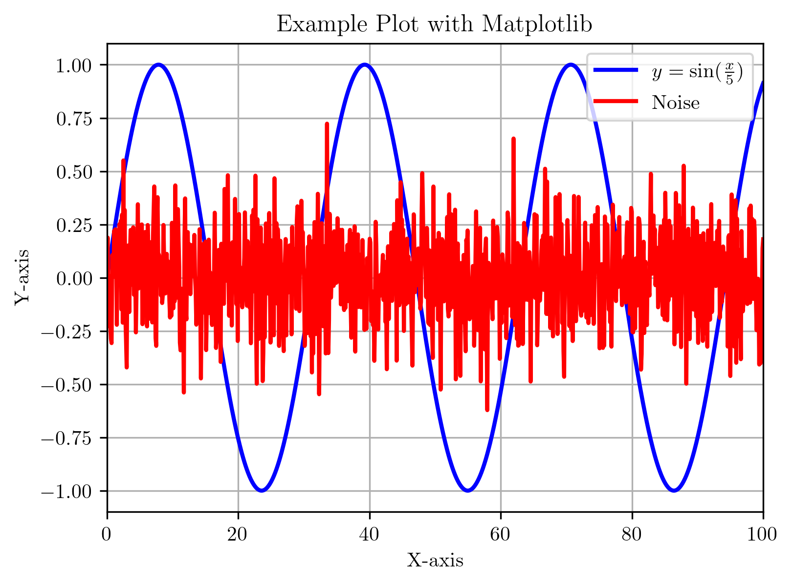
To import the resulting pgf file in a LaTeX document, we first need to add the following code to the preamble:
1
2
3
4
5
6
7
8
9
10
11
12
13
14
15
\usepackage{pgf}
\usepackage{lmodern}
\usepackage{import}

\def\mathdefault#1{#1}
\everymath=\expandafter{\the\everymath\displaystyle}
\IfFileExists{scrextend.sty}{
  \usepackage[fontsize=10.000000pt]{scrextend}
}{
  \renewcommand{\normalsize}{\fontsize{10.000000}{12.000000}\selectfont}
  \normalsize
}
\makeatletter\@ifpackageloaded{underscore}{}{\usepackage[strings]{underscore}}\makeatother

\usepackage[pdfusetitle,colorlinks,plainpages=false]{hyperref}
Assuming we placed the plot in a subfolder called ‘plots’ in the LaTeX project, we can import it in two ways:
1
\input{plots/example_plot_mpl.pgf}
1
\import{plots}{example_plot_mlp.pgf}
The second method has the advantage that it also works if the pgf file includes other files. This could happen when plotting a heatmap where the colorbar is exported as a separate image file.
A downside of the approach with the pgf plots is that we cannot rescale the plots when importing them into the LaTeX project. So when creating the plot, we already have to know how large the plot should be. Luckily, we can get the value of \textwidth in LaTeX by adding \the\textwidth somewhere in the text of our project. In my case, this resulted in 398.0pt, which is the width in points I used for the plot.